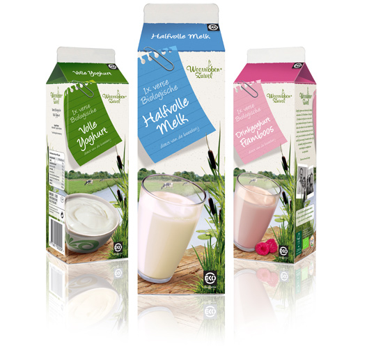
 Following to this restyling, a similar fresh and natural packaging design was created by Stepfive of milk and drinks for Dutch company Weerribben Zuivel. The visuals on the packaging are showing us the origin of the milk and drinks: National Park ‘De Weerribben’ in The Netherlands with its characteristic feather reed grass. The coloured shopping list is a powerful asset to match all twelve products into a coherent range.


Students from Design Skolen Kolding, Denmark, made videos for the UNICEF Innovation – Reuse of Packaging Challenge – over a period of three weeks in January 2011. They are all works in progress. More videos at their YouTube UNICEF Innovation Channel.

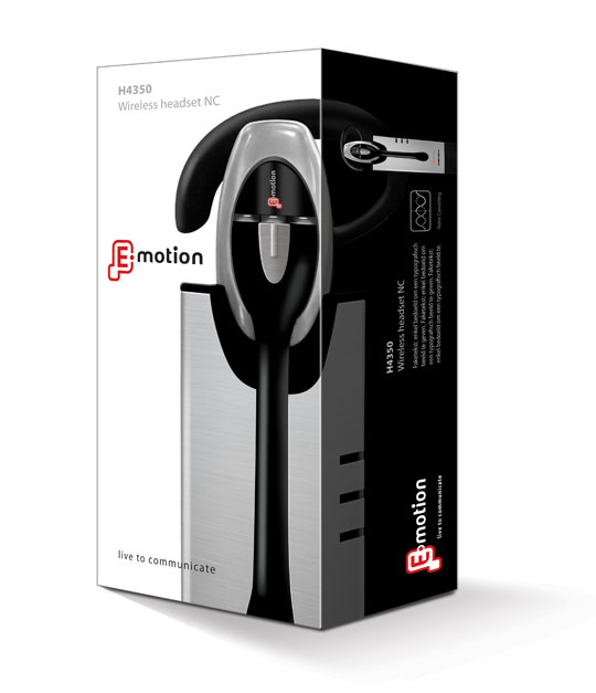 Stepfive created the packaging for this modern headset from Emotion. You will experience beautiful sounds and audio with this high-tech headset. The graphical appeal of the slick design- and metallook and high quality of the headset has been a source of inspiration for creating this clean yet strong packaging.

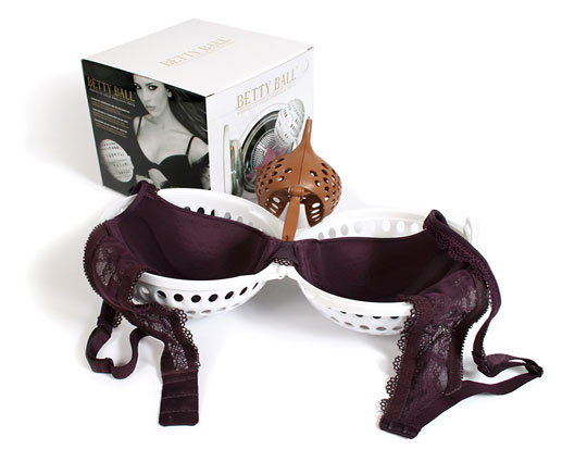
Why pay a lot of money for your beautiful bra and then have it ruined in your washing machine? The Betty Ball is the solution for keeping your padded or normal bras in perfect shape. Stepfive redesigned a golden/black packaging design with much attention to product experience and a luxury feeling. The Betty Ball was succesfully launched all over Europe.

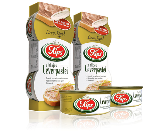 For the Dutch company Kips’, who actually celebrate their 100th anniversary this year, Stepfive created a golden packaging design for their tins with excellent liver p�t�. This exclusive and tasteful look with much attention to branding and product experience is successfully introduced at the Dutch consumer market. Kips’ is part of Zwanenberg Food Group.

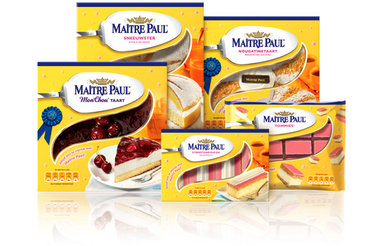 Preliminary to the rebranding of Carnaby into Ma�tre Paul Professional, the whole range of Ma�tre Paul’s pie boxes itself were renewed too. For the Dutch, French, English and German consumer market a new bright and yellow packaging design with a friendly festive and yet high-quality look was developed by Stepfive. The new boxes also have a renewed locking system and smaller windows to prevent them from freezing. This succesfull new packaging line includes seventeen flavors in various formats.

After a few days of incubating, molding and drying, mushroom roots are ready to be used as… packaging material! This biodegradable material is also fireproof and a good insulator. Get a peek at packaging in the 21st century in Innovation Nation with Miles O’Brien.

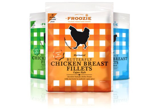 Dalco Food specialises in developing and producing meat and vegetarian meal components in The Netherlands and the United Kingdom. For their private label ‘Froozie’ on the English market, we created a new packaging design for the fresh frozen Butterfly Chicken Breast Fillets in flexible plastic bags. There are three strong color variations, matching the three different styles: cajun, garlic and regular. Along with this design, the new Froozie logo brand identity (also designed by Stepfive) was successfully introduced.

 Linera meat-products by Zwanenberg Food Group is a brand that stands for health, taste and honesty. For last years Linera rebranding, Stepfive created a complete new range of packaging design with emphasis on all their light products and a clear recognition and block formation in the storeshelf. This rebranding was successfully introduced at the Dutch consumers market.

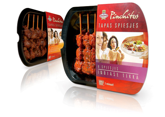 Health and convenience also becomes more and more important within the Dutch food industry. That’s why Zwanenberg Food Group choose for ‘the other way to snack’ with Pinchitos Tapas Spears: no chips, but a healthy and light meat snack, that only takes one minute in the microwave to prepare. Together with Boom Packaging, Stepfive created a fresh and open packaging design along with the Pinchitos brand identity for this healthy snack in five different flavors.


