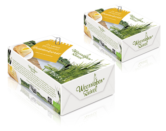
 In addition to this restyling, a new organic butter packaging design was created for Dutch company Weerribben Zuivel. Fresh and natural visuals on the packaging are showing us the origin of this organic butter: National Park �De Weerribben� in The Netherlands. These visuals and the coloured shopping list on top derives from the complete restyling by Stepfive of all the other Weerribben products and herewith makes it into a coherent and appetizing product range.


 A while ago, MOTI (Museum Of The Image, Breda) held an exhibit about packaging. This led to an interesting question: why is there currently a substantial shortage of packaging designers in the Netherlands? The answer can be found somewhere between �current art education is mainly focussed on the encouragement on autonomy instead of serving commercial goals�, and � as a logical result of this: �designers consider themselves belonging to a cultural avantgarde�.
In other words: packaging belongs to low-culture. Low culture = not sexy. Meanwhile, packaging specialized agencies (like ours) keep getting busier. So it�s high time to turn some persistent assumptions around by pointing out precisely how �sexy� the trade of packaging really is. After all, it evokes graphic design, (strongly based on psychology), marketing, brand-development, environmental matters, innovation and (brand)activation.
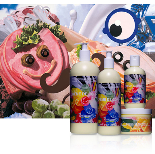
So, art schools: here�s a start for an interesting discussion on what Dutch Design really can be all about. And who will be the first to flick the switch and jump into the trade that�s as design-extensive as it is a guarantee on an interesting job? In the meanwhile you can enjoy some work made by �commercial explorer� Jeff Koons (shown above) and his design for body milk, by which he turned his art into �the daily�, instead of �the daily� into art. Oh, and the first run of packaging-trained students can send their portfolio to us � but that goes without saying.

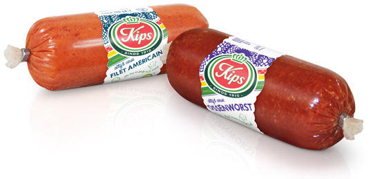 For the Dutch company Kips (part of Zwanenberg Food Group), we designed a series of contemporary labels/banderols with optimum product visibility that convey top quality. Each label comes in a different colour setting for each different taste variety.

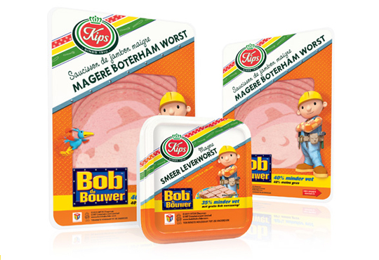 The packaging design for the international figure Bob the BuilderTM baloney and liver pat� was created by Stepfive, commissioned by Zwanenberg Food Group. This delicious sandwich filling for children appeals not only to the youngest ones. Due to it�s strong presence, it also looks very desireable on the shelf. Bob the BuilderTM makes lunch and breakfast even more fun!

 For Look-O-Look, Stepfive developed a new and contemporary line of packages (for 29 different candies) which will replace the current ‘kopkaartjes’ (transparent candy bags). These new flowpacks are designed in a handy size and are easy to open, which creates optimal ease in use. The new flowpacks have a fun, fresh and strong packaging design which corresponds perfectly with the target group. The flowpack design also contains a clear product-communication and an optimal visibility for a maximal impulse, which really distinguishes this packaging in stores from it’s competitors.

In a world of tremendous fast growing digitalization, packaging design can’t stay far behind. Want to ‘feel’ a package and see it’s benefits without having the actual package in hands? Apps and other digital media provides us, in combination with regular printed media, an innovative and even better way of advertising.
Stepfive Communication & Design designed and developed a mobile and desktop website for Dutch candy producer Look-O-Look, to be reached by a QR-code at advertisements. Consumers and sales managers can digitally feel and navigate around the new package design at this site. In combination with printed and social media it gives Look-O-Look a wide spread and an effective campaign to show their brand and products.

 Stepfive creates new distinctive retail and catering concepts for food and beverage brands on a daily basis. We develop new concepts, recipes, brands and packaging design together with our clients. We also revitalise existing products on our own initiative, because we are convinced many products could have a more successful brand appearance with the right adaption and repositioning. For example, we have created this new concept for Bloody Mary.
This Bloody Mary concept can be used for the catering and retail sector. The bottle has two facings (meant for standing and hanging) and can therefore be placed on a shelf, perhaps in a retail environment, or can be suspended within catering establishments. You also have the option of attaching a connecting piece with a hose, allowing drinking glasses to be filled with Bloody Mary from a bottle hanging on the bar.

 The packaging design for the international figure Bob the BuilderTM luncheon meat and liver pat� was created by Stepfive for Zwanenberg Food Group. This delicious sandwich filling for children appeals not only to the youngest ones. Due to it’s strong presence, it also looks very desireable on the shelf. Bob the BuilderTM makes lunch and breakfast even more fun!

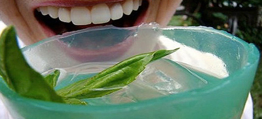 Packing design evolves. An edible bottle made from organic materials that is biodegradable too? No problem. Dr. David Edwards (professor at Harvard) is working on the WikiCells project that looks into creating edible packaging. WikiCell membranes can hold the drink together and can also be consumed afterwards. These membranes could be made out of something tasty, like chocolate or candy.
There are some hurdles to be taken though. Hygiene for instance. Products in ready-made packaging go through many hands – literally – before they reach the end consumer, and despite the companies’ assurances of their products’ safety, it is unlikely that consumers would be willing to nibble on something whose hygiene can so clearly be compromised. Still, marketing and recycling experts agree that there is room for experimentation.
Wish to try some of Edwards’ experimental edible packaging? You can sample them at the stunningly beautiful Lab Store Paris.

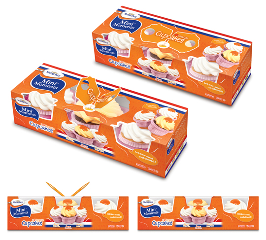 Stepfive created these packaging designs for Ma�tre Paul�s Oranje Cupcakes. The goal: creating a visually appealing and festive package which could be presented like, as it were, a real gift. Especially for typical Dutch traditions and parties such as ‘Queen’s Day’, but for (inter)national sport events as for instance soccer championships as well. ‘Cause after all, the Dutch colour is orange. Ma�tre Paul�s Oranje Cupcakes are the perfect treat for those special little moments. They are nice to give and fun to get!� There are three cupcakes per package.
More on Ma�tre Paul Cupcakes original design here.


