 Again a wonderfull asset for our bookshelf, “packed” with inspiration: THE ART OF PACKAGE DESIGN. A recent assembly of international designers is creating highly outstanding and savvy designs to complement the nature and function of a product. Editor Wendy Xu included the Atelier LaDurance Japanese Denim packaging in the publication that is about innovative packaging designs that functions beyond ‘simply product wrappers’. A creative treasure published by Gingko Press: www.gingkopress.com


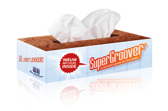 Stepfive developed packaging design (a tissue box) as part of an introduction campaign for a new take on a typical Dutch snack, the Frikandel. This new breed contains onion, so we thought it was appropriate to reach out to anyone eating it by providing free tissues for all those teary eyes. ‘So good, you could cry’.

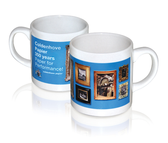 For Coldenhove Paper,� Stepfive designed the company’s Stand including the give-away mug, all for the FESPA Digital 2011 in Hamburg. This paper manufactorer develops innovative paper like Digital dye sublimation paper, which is particularly interesting for designers in the field of product-, interior- and packaging design. The mug shows how the sublimation really gets into the material! Its not just a print on a mug, but a print in the actual glaze! Almost every item and material can easily be sublimed with designs you like. It’s solid, sharp and scratch-proof.
Digital dye sublimation is probably the most spectacular innovation of the last decades in the digital graphics industry. This leading-edge application represents the adaptation of advanced digital printing to the conventional process of dye sublimation transfer. By developing a range of transfer papers that offers the highest transfer yield, the best printabillity and runnability, in close co-operation with (amongst others) customers and leading equipment and media manufacturers.
see also: www.coldenhove.com

 Involving designers in new product development leads to greater emphasis on experiential and functional design. Emphasis on experiential and functional design leads to improved new product performance, particularly if designers are given a high degree of freedom to explore ideas outside the project scope, experiential design is innovative, functional design is innovative and customer involvement is limited.
These are some of the findings by the Rotterdam School of Management in collaboration with the Faculty of Industrial Design Engineering.
According to their research, products will be almost 20% more profitable when more attention is being paid to design and visual appearance during development of products.
Click here to download the complete research (PDF).

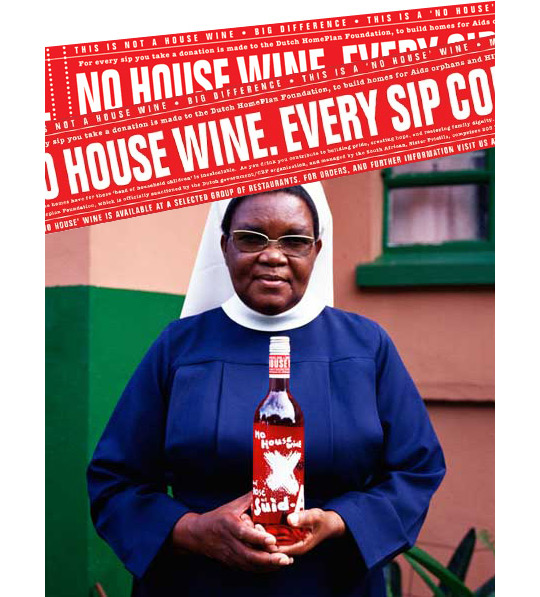 Excellent Packaging design and social responsibility can go hand in hand. A good exemple is ‘No House Wine’, a new wine-label that uses it’s profits to build houses for so called kid-parents (older brothers and sisters who take care of their younger ones) of HIV-contaminated families. It prevents kids from getting homeless after their parents died of AIDS.
The international awarded design (New York Festivals (silver), Art Directors Club Nederland (zilveren lamp), Epica (silver) was designed by� Edwin Vollebergh. It delicately cites the subject (houses and moving): an apparently handwritten signing on the front and a label made of packaging-tape on the back.
More on ‘No House’ Wine here.

 ”Global standards on packaging and the environment have gained conclusive momentum with the acceptance of the draft international standard (DIS) texts this week, say industry experts. The new ISO-standards will address the optimization of packaging to minimise its environmental impact, the responsible use of heavy metals and other hazardous substances, the possible reuse of packages and the different modes of recycling (material, energy or composting). The new ISO world standards will most likely be available for use by industry, retail and any other interested organisation by the end of 2012.”
More on the new ISO-standards here and here (pdf).

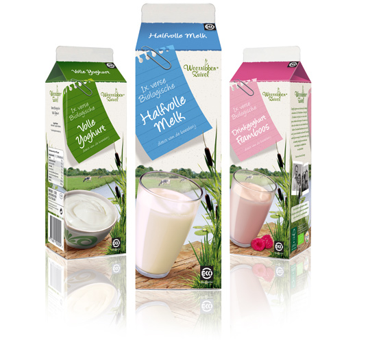 Following to this restyling, a similar fresh and natural packaging design was created by Stepfive of milk and drinks for Dutch company Weerribben Zuivel. The visuals on the packaging are showing us the origin of the milk and drinks: National Park ‘De Weerribben’ in The Netherlands with its characteristic feather reed grass. The coloured shopping list is a powerful asset to match all twelve products into a coherent range.

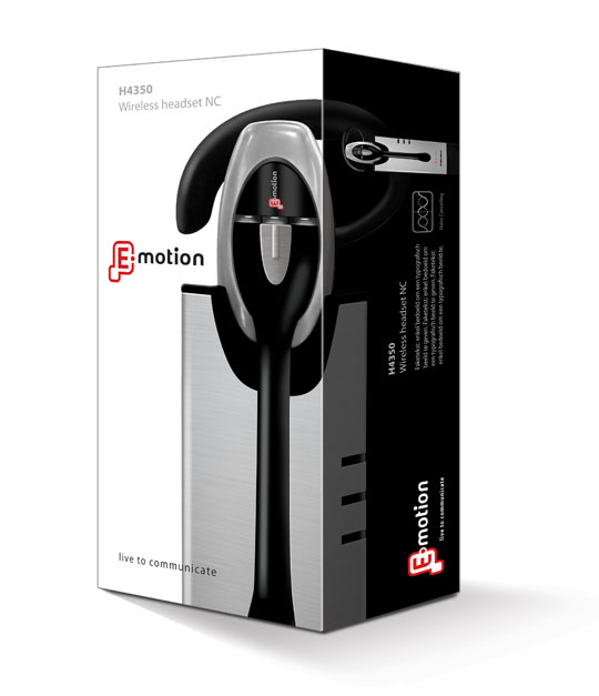 Stepfive created the packaging for this modern headset from Emotion. You will experience beautiful sounds and audio with this high-tech headset. The graphical appeal of the slick design- and metallook and high quality of the headset has been a source of inspiration for creating this clean yet strong packaging.

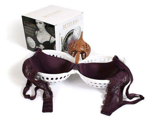
Why pay a lot of money for your beautiful bra and then have it ruined in your washing machine? The Betty Ball is the solution for keeping your padded or normal bras in perfect shape. Stepfive redesigned a golden/black packaging design with much attention to product experience and a luxury feeling. The Betty Ball was succesfully launched all over Europe.

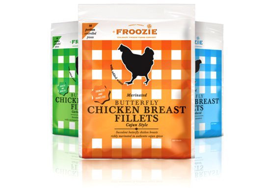 Dalco Food specialises in developing and producing meat and vegetarian meal components in The Netherlands and the United Kingdom. For their private label ‘Froozie’ on the English market, we created a new packaging design for the fresh frozen Butterfly Chicken Breast Fillets in flexible plastic bags. There are three strong color variations, matching the three different styles: cajun, garlic and regular. Along with this design, the new Froozie logo brand identity (also designed by Stepfive) was successfully introduced.


