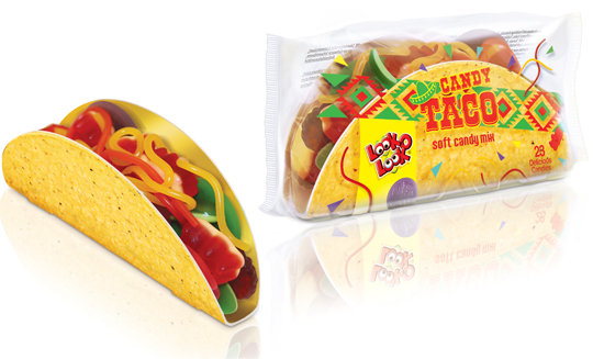
 The Candy Taco is a nice and cheerful product with a great recognisability that you can easily share with others, but is also very nice to give. The transparent foil decorated with a Mexican touch provides the right taco feel, along with the matching typography and sombrero. Due to the transparency there is an excellent view of the sweets in the taco. The cardboard taco shell itself is printed on the outside with a realistic print, making the overall packaging design of this Look-O-Look product even more appetizing.
==
De Candy Taco is een lekker vrolijk product met een grote herkenbaarheid dat je makkelijk kunt delen met anderen, maar ook heel leuk is om te geven. De met een Mexicaanse touch gedecoreerde transparante folie zorgt voor het juiste taco gevoel, samen met de bijpassende typografie en sombrero. Door de transparantie is er uitstekend zicht op de snoepjes in de taco. De kartonnen tacoschelp zelf is aan de buitenzijde met een realistische print bedrukt, waardoor het totale packaging design van dit Look-O-Look product nog eens extra appetijtelijk oogt.

Last year there were still a few design agencies and food photographers present. Unfortunately, this 4th edition of the Packaging Innovations Event in Zaandam has become more and more a representation of the printing industry. Of course it’s always nice to meet colleagues in the profession to speak with, but you can barely still call it ‘the most innovative and inspirational packaging event’. Next year, a new opportunity?
See more at: www.easyfairs.com
 On November 26th & 27th Packaging Innovations will bring together the best professionals of branded packaging and retail design. Specialists show designs, product presentations, new materials and solutions for packaging problems.
See more at: www.easyfairs.com
 At Dutch website Groene Offerte you’ll find loads of interesting packaging design related articles, opinions and other stuff (all in Dutch). Especially the serie ‘Food for Thought’ gives entertaining and remarkable examples of packaging design in all its aspects, good or bad.
Groene Offerte is established for the complete design industry. The site is set up to grow: more and more contacts, knowledge and new insights. In this way Groene Offerte wants to help and encourage the design industry with their key role of this industry in the sustainable development of society and economy.
Food for Thought at Groene Offerte (all in Dutch).
With a superb show, Heineken showed their latest invention at this year’s Milan Design Week: an interactive bottle to re-invent your night out!
Cool.
 A niche topic, a clear defined target group, a sharp program content, up to 80 stand units, a low entry fee et voil�, the ingredients that’ll make ‘Foodpacking Event 2013’ into a special event. The exhibition will take place on October 9 and 10 (Wednesday and Thursday) and will be held in ‘High Five’ in the ‘Jaarbeurscomplex’ in Utrecht, The Netherlands.
This event has been given the subtitle: High knowledge event on packaging in the food industry.
Read more here (Dutch).
 The characteristic brown beer bottle will turn just as green as the bottles that Heineken sells worldwide. The Brown bottle is a relic of Dutch appointments made decades ago to redeem deposit-bottles. Brown glass is recycled by most Dutch brewers, so it doesn’t matter which Brewer is taking in a bottle. Green glass is much less established. First, the green bottle was intended as an export bottle, but over the years it has become the color of the Heineken brand. The exchange operation began twenty years ago. In 1992 the Red cap disappeared, six years afterwards the yellow crates turned green and since 2000 all Lightboxes are green as well.
 A compilation of yearly design awards, this book features the best in communication and packaging design from around the world. The iF communication design awards have been conferred since 2004 by a panel of design experts from across the world. Showcased in this volume are the most outstanding examples of communication and packaging design. This yearbook presents trendsetting achievement in advertising, media, campaigns, packaging, and websites.
Read more here, or buy here.
In a world of tremendous fast growing digitalization, packaging design can’t stay far behind. Want to ‘feel’ a package and see it’s benefits without having the actual package in hands? Apps and other digital media provides us, in combination with regular printed media, an innovative and even better way of advertising.
Stepfive Communication & Design designed and developed a mobile and desktop website for Dutch candy producer Look-O-Look, to be reached by a QR-code at advertisements. Consumers and sales managers can digitally feel and navigate around the new package design at this site. In combination with printed and social media it gives Look-O-Look a wide spread and an effective campaign to show their brand and products.
 Stepfive creates new distinctive retail and catering concepts for food and beverage brands on a daily basis. We develop new concepts, recipes, brands and packaging design together with our clients. We also revitalise existing products on our own initiative, because we are convinced many products could have a more successful brand appearance with the right adaption and repositioning. For example, we have created this new concept for Bloody Mary.
This Bloody Mary concept can be used for the catering and retail sector. The bottle has two facings (meant for standing and hanging) and can therefore be placed on a shelf, perhaps in a retail environment, or can be suspended within catering establishments. You also have the option of attaching a connecting piece with a hose, allowing drinking glasses to be filled with Bloody Mary from a bottle hanging on the bar.


-
Archives
- August 2018
- July 2018
- June 2018
- May 2018
- April 2018
- March 2018
- February 2018
- January 2018
- November 2017
- October 2017
- September 2017
- April 2017
- February 2017
- December 2016
- October 2016
- September 2016
- July 2016
- May 2016
- March 2016
- January 2016
- November 2015
- October 2015
- August 2015
- June 2015
- May 2015
- April 2015
- February 2015
- January 2015
- December 2014
- November 2014
- October 2014
- September 2014
- August 2014
- June 2014
- May 2014
- April 2014
- March 2014
- February 2014
- January 2014
- December 2013
- November 2013
- October 2013
- September 2013
- August 2013
- June 2013
- May 2013
- April 2013
- March 2013
- February 2013
- January 2013
- December 2012
- November 2012
- October 2012
- September 2012
- August 2012
- July 2012
- June 2012
- May 2012
- April 2012
- March 2012
- February 2012
- January 2012
- December 2011
- November 2011
- October 2011
- September 2011
- August 2011
- July 2011
- June 2011
- May 2011
- April 2011
- March 2011
- February 2011
- January 2011