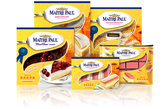
 Preliminary to the rebranding of Carnaby into Ma�tre Paul Professional, the whole range of Ma�tre Paul’s pie boxes itself were renewed too. For the Dutch, French, English and German consumer market a new bright and yellow packaging design with a friendly festive and yet high-quality look was developed by Stepfive. The new boxes also have a renewed locking system and smaller windows to prevent them from freezing. This succesfull new packaging line includes seventeen flavors in various formats.


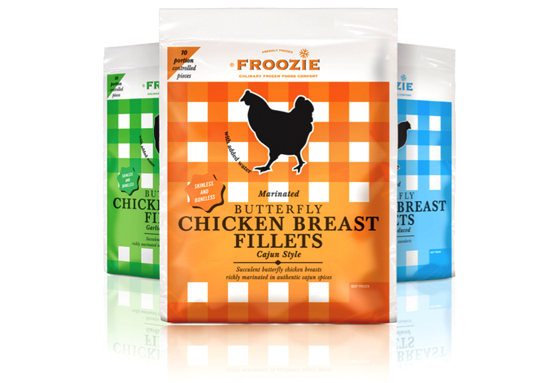 Dalco Food specialises in developing and producing meat and vegetarian meal components in The Netherlands and the United Kingdom. For their private label ‘Froozie’ on the English market, we created a new packaging design for the fresh frozen Butterfly Chicken Breast Fillets in flexible plastic bags. There are three strong color variations, matching the three different styles: cajun, garlic and regular. Along with this design, the new Froozie logo brand identity (also designed by Stepfive) was successfully introduced.

 Linera meat-products by Zwanenberg Food Group is a brand that stands for health, taste and honesty. For last years Linera rebranding, Stepfive created a complete new range of packaging design with emphasis on all their light products and a clear recognition and block formation in the storeshelf. This rebranding was successfully introduced at the Dutch consumers market.

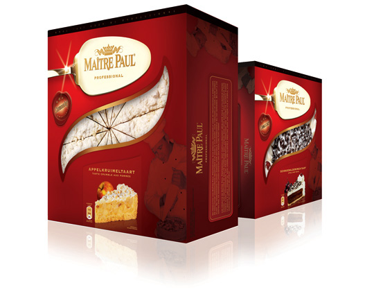 One of Ma�tre Pauls successful private labels, Carnaby, is rebranded into Ma�tre Paul Professional in the past few months. The Ma�tre Paul Professional brand is aimed at the foodservice and cash & carry market. Their high-quality pies are unique in their kind, but accessible to all foodservice customers. The new packaging design made by Stepfive, reflects the high-quality and craftsmanship of the Dutch Ma�tre Paul bakers and is developed in a range for 16 different products with 16 different labels.

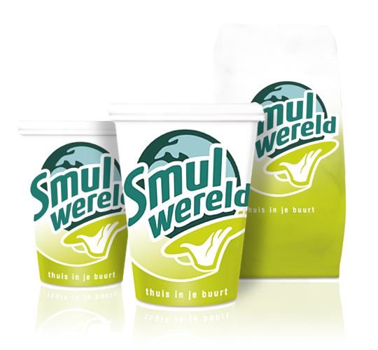 FFC (Franchise Friendly Concepts) is the largest independent Dutch food franchise organization with several success formulas. One of them: Smulwereld. The new logo created for their rebranding is modern with a healthy look and symbolizes the propositions. Along with this rebranding a complete range of disposables was designed. This rebranding was implemented in all 100 Smulwereld companies in The Netherlands, together with signings and interior adjustments.

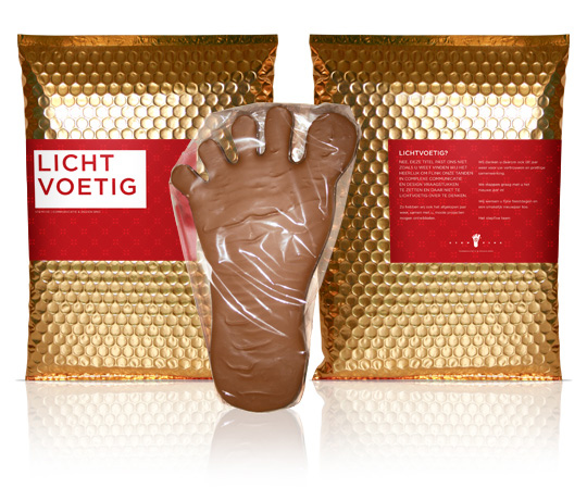 Light-footed (in Dutch: lichtvoetig) ain’t a title that fits Stepfive Communication & Design too well. Contrary, we just love to do complex and new issues concerning packaging design and other graphic jobs for our clients! And we do love a chocolate bite too. That’s why we gave our clients this delicious chocolate foot last december as a new years present: to eat your heart out with Stepfive.


