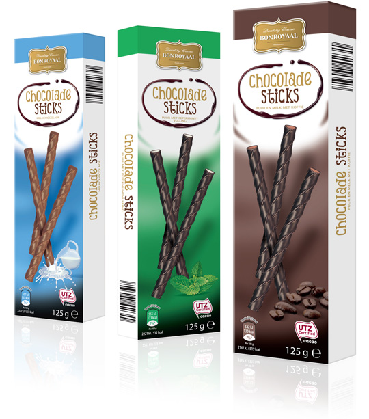
 Another example of the Bonroyaal chocolate products line that recently has been restyled by Stepfive for Aldi Netherlands are the most delicious Chocolate Sticks. These sticks come in three different flavours (pure and milk with coffee, pure with mint and plain milk). This packaging design follows the style that was already created for Bonroyaal by Stepfive. All three flavours have its own colour signing.


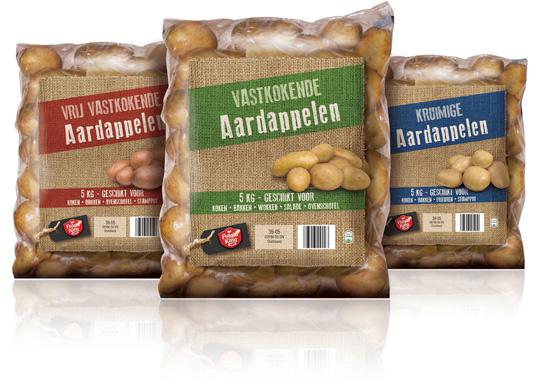 The look of several different products from Potato King, an already existing Aldi brand, is completely renewed by Stepfive for Aldi Netherlands. Above you can see some of the potato breeds that are now packed in a foil with jute suggestion on it and a tasteful product visual. Every single breed has its own colour signing to finish this authentic packaging design with a natural feel.

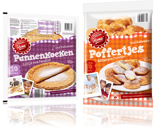 Yet another new brand for Aldi Netherlands, designed and conceptualized by Stepfive. Meet ‘Delicious Home’, a mark that stands for a tasty range of (sometimes raw) dough products, such as croissants, pancakes and a typical Dutch specialty: poffertjes.
The packaging design for these pancakes and poffertjes are dressed up with bright, traditional table-cloth patterns and tasteful product visuals.

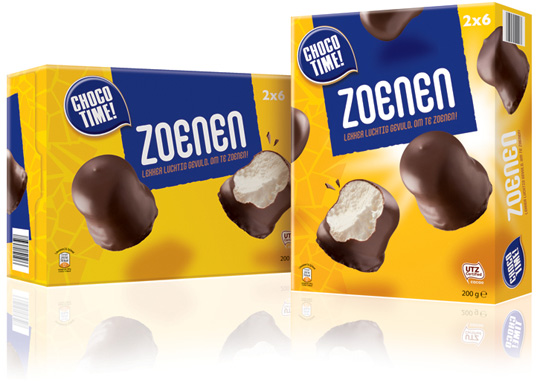 Again new branding and packaging designs for Aldi Netherlands. This time it’s CHOCO TIME!, a new brand created by Stepfive for an extensive range of chocolate related products. The first one created in this range are the ‘Zoenen’: tasteful, creamy puffs surrounded by delicious chocolate.

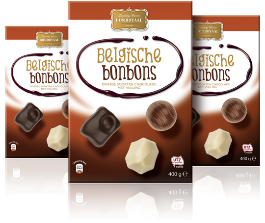 A brand new packaging design for Aldi’s Belgian pralines, designed and branded by Stepfive. Bonroyaal is Aldi’s new chocolate line for The Netherlands. Stepfive conceptualized this new brand and already created the packaging design for several other chocolate products.

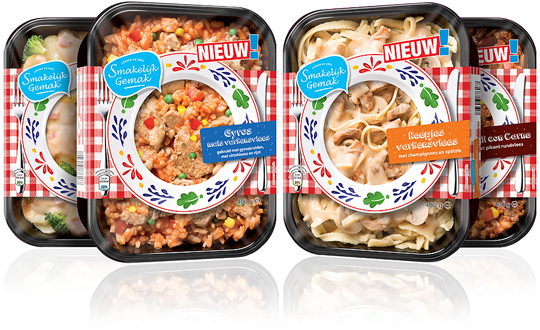 Ready-to-eat meals with a new branding and new packaging design, all created by Stepfive for Aldi Netherlands. The carton sleeves have a recognizable image of traditional Dutch plates served with the food that’s inside on it. The brand ‘Smakelijk Gemak’ (tasty convenience in English) will be used for a very extensive range of products of which the first series meanwhile are finished.
These ready-to-eat meals are packed in matching shelf ready packaging (SRP) boxes.

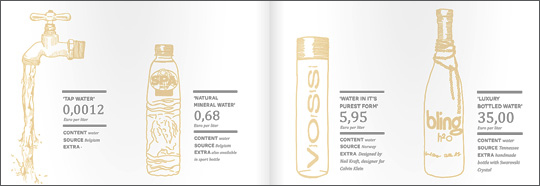 An inspiring and interesting brand new book by Dutch publisher BIS Publishers out this month about ‘the essence of retail branding and design’.
”Retail mirrors society and as society is constantly changing, retail has to be able to anticipate these changes in order to maintain its right of existence. In short; act, react or suffer! This book covers all the facets of retail branding, holistic formula development and the essential one-to-one relationship with your customers.” -> Buy at BIS Publishers or view large and read at ISSUU

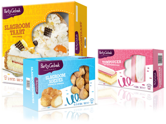 Throwing a party? Make it extra festive with Aldi’s ‘PartyGebak’ (Party Pastries). Stepfive created the new packaging design for the complete range of PartyGebak products in The Netherlands and also created the new branding.
A visually appealing, festive and joyous packaging design that lightens up every party and any other moment of fun.

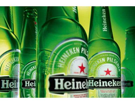 The characteristic brown beer bottle will turn just as green as the bottles that Heineken sells worldwide. The Brown bottle is a relic of Dutch appointments made decades ago to redeem deposit-bottles. Brown glass is recycled by most Dutch brewers, so it doesn’t matter which Brewer is taking in a bottle. Green glass is much less established. First, the green bottle was intended as an export bottle, but over the years it has become the color of the Heineken brand. The exchange operation began twenty years ago. In 1992 the Red cap disappeared, six years afterwards the yellow crates turned green and since 2000 all Lightboxes are green as well.

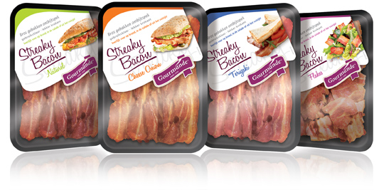 Gourmande is the consumers brand of ‘henri van de bilt vleeswaren’, who produces deli meats from single meat cuts and convenience products. Stepfive rebranded the Gourmande logo and also created four remarkable packaging labels for their range of Streaky Bacon products. These labels come with much attention for branding and meanwhile have a spot on the visibility of the products. Each label has it’s own fresh colour setting for each different taste variety.


