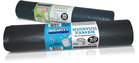
 Wrapitt (Kitchen Aid) is one the new household brands that was introduced by Aldi Netherlands the last few months. Wrapitt consists of products like carbage bags, aluminum foils, fresh foils, (doggy) bags, culinary parchment paper, freezer bags and so on. Brand identity and all packaging design was conceptualized and created by Stepfive Communication & Design BNO.


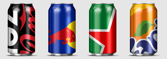 Wondering how far you can push your packaging design to the limit? Designer Ewan Yap presents his ”Big Brand Theory” on Behance with some major and iconic brands (think Heineken, Coca-Cola, Pepsi, Red Bull etc.). His beautiful work is an experiment in brand aesthetics, and also informs us on the cropability of� logos in terms of image cropability.
Check out the cropability of a brand (or the guts to leave things out).

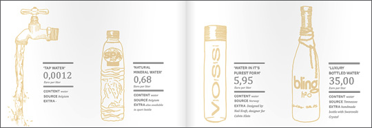 An inspiring and interesting brand new book by Dutch publisher BIS Publishers out this month about ‘the essence of retail branding and design’.
”Retail mirrors society and as society is constantly changing, retail has to be able to anticipate these changes in order to maintain its right of existence. In short; act, react or suffer! This book covers all the facets of retail branding, holistic formula development and the essential one-to-one relationship with your customers.” -> Buy at BIS Publishers or view large and read at ISSUU

 This manufactorer, based in Europe, delivers quality toys with a high degree of educational values. These toys are built to last and are internationally recognized with lots of prestigious awards. Stepfive created several packaging concepts that fitted this high standard of quality, while gaining presence due to the use of bright colours and clear typography. Using different materials was a handy tool that allowed us to make a clear difference between the many product groups. We also created an opening in each design that allows buyers to actually feel the products� quality � an essential factor in deciding wether or not to buy the toy.

 Again a wonderfull asset for our bookshelf, “packed” with inspiration: THE ART OF PACKAGE DESIGN. A recent assembly of international designers is creating highly outstanding and savvy designs to complement the nature and function of a product. Editor Wendy Xu included the Atelier LaDurance Japanese Denim packaging in the publication that is about innovative packaging designs that functions beyond ‘simply product wrappers’. A creative treasure published by Gingko Press: www.gingkopress.com

 Stepfive created several design concepts for the toys including the ones you can see here. White, combined with a strong primary colour or colours gives a stronger result than white with weakened pastels, because that makes it look old fashioned and dirty. In contrary, white gives the designs a fresh and modern look with yet a responsable touch at the same time. Therefore we choose to work mainly with white combined with fresh and bright colours. The design above are shown as 3D view, as separate packaging and as separate packaging on a plastic display stand.

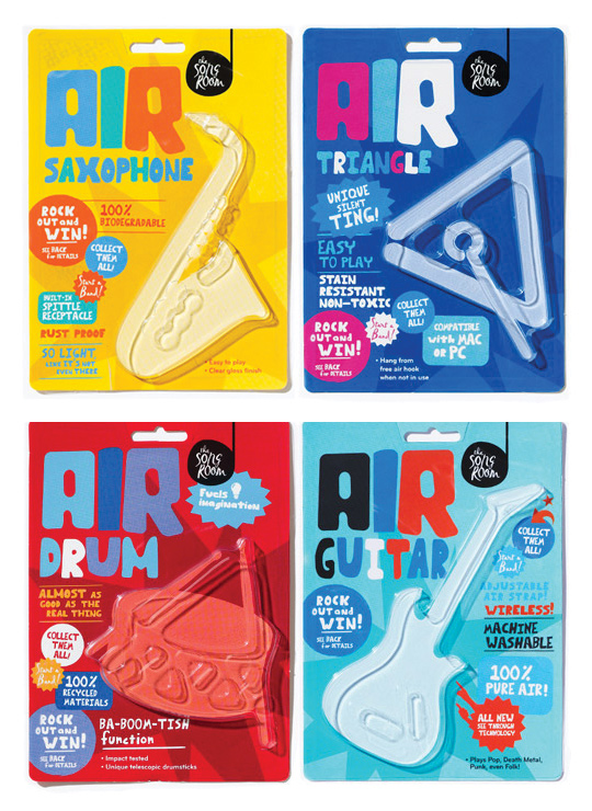 A fine example of what pakaging can do besides just containing and/or selling a product, given by Designworks Melbourne. These air-instruments are part of a ‘Play Air Campagne’, a campaign which helped raise money for an organisation called The Song Room. The Song Room is a charitable organisation who help ensure that underprivileged schools can allow their students to partake in creativity. Deservedly nominated for a Cannes Lions award for Promo & Activation.

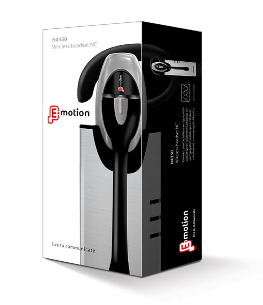 Stepfive created the packaging for this modern headset from Emotion. You will experience beautiful sounds and audio with this high-tech headset. The graphical appeal of the slick design- and metallook and high quality of the headset has been a source of inspiration for creating this clean yet strong packaging.

 Fuente is dedicated to developing exclusive, naturally-based hair care, colour, transformation and styling products. Stepfive designed a new packaging line in a natural atmospheric style for their bottles, jars and tubes, after a thoroughly brand positioning analysis. Commissioned by Oosterbeek Verpakkingen from The Netherlands.

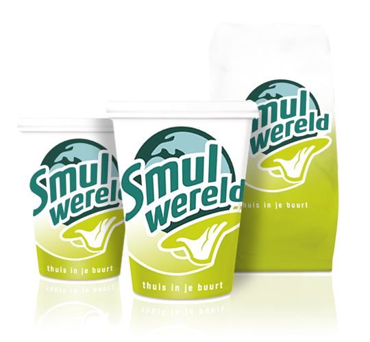 FFC (Franchise Friendly Concepts) is the largest independent Dutch food franchise organization with several success formulas. One of them: Smulwereld. The new logo created for their rebranding is modern with a healthy look and symbolizes the propositions. Along with this rebranding a complete range of disposables was designed. This rebranding was implemented in all 100 Smulwereld companies in The Netherlands, together with signings and interior adjustments.


