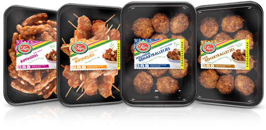
 Chickenfingers, mini chicken skewers, Dutch meatballs and meatballs sat�h. Four new products by Kips (a brand of Zwanenberg Food Group) of which Stepfive created packaging labels for. The labels have unique colours for each product and are placed right in the middle so there’s still a good spot on the delicious snacks.


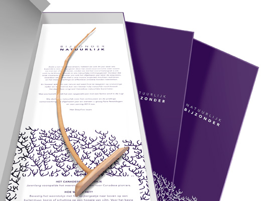 As we’re used to each end of the year, we created a special gift last december to send to our clients and other relations for the successful cooperation in 2012. This year we designed an extraordinary box named ‘Bijzonder Natuurlijk’ (‘Especially Naturally’ in English) with a specific Canadian piece of wood in it, able to predict the weather: a natural barometer.
Curious for more? Check the latest and past projects for our clients over there.

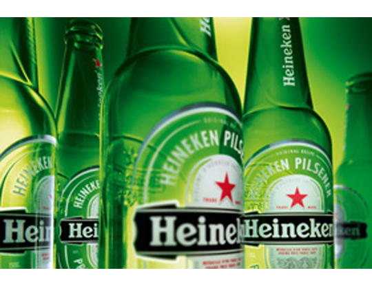 The characteristic brown beer bottle will turn just as green as the bottles that Heineken sells worldwide. The Brown bottle is a relic of Dutch appointments made decades ago to redeem deposit-bottles. Brown glass is recycled by most Dutch brewers, so it doesn’t matter which Brewer is taking in a bottle. Green glass is much less established. First, the green bottle was intended as an export bottle, but over the years it has become the color of the Heineken brand. The exchange operation began twenty years ago. In 1992 the Red cap disappeared, six years afterwards the yellow crates turned green and since 2000 all Lightboxes are green as well.

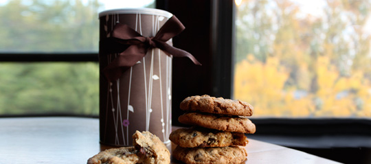 Ever thought about just how persuasive packaging can be? Supermarkets use carefully designed packaging to influence customers’ perceptions of their products. But does it work? It was tested with chocolate chip cookies on two groups of people, one group tasted and rated the cookies without seeing any of the packaging, while the other group did the same thing while the packets were shown beforehand. Read about the results here.
Packaging is one way of making a product get your attention. But there’s more. Every element of the in-store environment is carefully deliberated over; from the general layout to the position of products on the shelf and even the smell and sound.
Read more about psychological tactic in stores here.

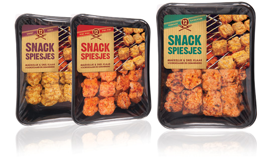 Piece of cake for the urban grillmeisters behind their BBQ’s these days with the new and delicious Snack Skewers (Snack Spiesjes) from Dutch company Zwanenberg Food Group. Stepfive created the labels for this new product range. Each different taste variety has its own colour setting and the labels are placed at the top in order to have a good spot on the tasteful skewers.

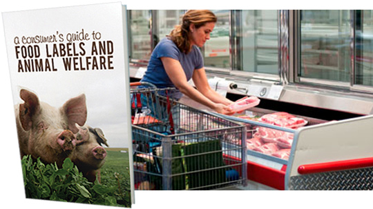 Many food labels are confusing (and some downright misleading) especially with regard to animal welfare claims. To help navigate the confusion, the Animal Welfare Institute (AWI) has released A Consumer’s Guide to Food Labels and Animal Welfare.
This new guide aims to help consumers who purchase meat, dairy and eggs interpret the meaning of label claims and locate products from animals who were humanely raised and handled.
More on ‘A Consumer’s Guide to Food Labels and Animal Welfare’ here.

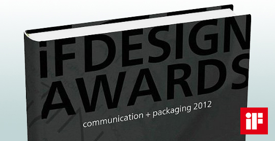 A compilation of yearly design awards, this book features the best in communication and packaging design from around the world. The iF communication design awards have been conferred since 2004 by a panel of design experts from across the world. Showcased in this volume are the most outstanding examples of communication and packaging design. This yearbook presents trendsetting achievement in advertising, media, campaigns, packaging, and websites.
Read more here, or buy here.

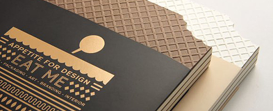 Eating a pure experience of smell and taste? No longer. Nowadays it’s rather an effective agency to communicate and engage, an indication of cultural values, lifestyle, ispirations and imagination.
This showcase is complemented by fascinating insights in their forewords and case studies given by experts, entrepreneurs and practitioners, each distinct with regards to their experience in product, packaging, image-making, branding and interior design.

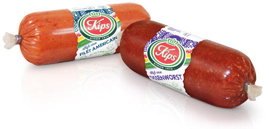 For the Dutch company Kips (part of Zwanenberg Food Group), we designed a series of contemporary labels/banderols with optimum product visibility that convey top quality. Each label comes in a different colour setting for each different taste variety.

In a world of tremendous fast growing digitalization, packaging design can’t stay far behind. Want to ‘feel’ a package and see it’s benefits without having the actual package in hands? Apps and other digital media provides us, in combination with regular printed media, an innovative and even better way of advertising.
Stepfive Communication & Design designed and developed a mobile and desktop website for Dutch candy producer Look-O-Look, to be reached by a QR-code at advertisements. Consumers and sales managers can digitally feel and navigate around the new package design at this site. In combination with printed and social media it gives Look-O-Look a wide spread and an effective campaign to show their brand and products.


