March 23rd, 2018 | 05:13 pm
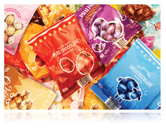 Just like previous years, we were asked to create the packaging design for the Aldi Easter products. It resulted in several colorful designs with cheerful illustrative see-through windows for products such as chocolate eggs, egg-shaped cookies, chocolate Easter bunnies, Easter eggs filled with chocolates, cookies, dragee eggs and much more.
==
Net als voorgaande jaren heeft Stepfive ook in 2018 voor Aldi het design van de Paaslijn verzorgd. Het gaat in alle gevallen om kleurrijke designs met vrolijke illustratieve doorkijkvensters voor producten als (gevulde) chocolade eitjes, eivormige koekjes, chocolade paashazen, eieren gevuld met chocolaatjes, paashaaskoekjes, dragee eitjes en nog veel meer.
POSTED IN food | no comments »
February 26th, 2018 | 04:51 pm
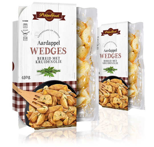 For the brand PolderGoud of potato producer Schaap Holland we’ve developed the sleeves of the potato wedges. It resulted in clear sleeves with a leading role for the potato wedges itself. They are located in a stylish black scale, photographed from above, which is on a whitewash wooden floor. The typography in the color of the tablecloth under the scale gives the whole a familiar and authentic feeling.
==
Voor het merk PolderGoud van aardappelproducent Schaap Holland hebben wij de sleeves van de aardappel wedges mogen ontwikkelen. Het heeft geresulteerd in heldere sleeves met een hoofdrol voor de aardappel wedges zelf. Ze liggen in een stijlvol zwarte schaal, van bovenaf gefotografeerd, die op een whitewash houten vloer is gepositioneerd. De typografie in de kleur van het kleedje onder de schaal geeft het geheel een vertrouwd en ambachtelijk gevoel.
TAGS: Dutch, Netherlands, packaging design, Poldergoud, Schaap Holland, sleeve, Stepfive
POSTED IN food | no comments »

February 09th, 2018 | 03:37 pm
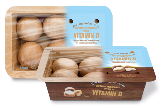 Banken Champignons serves with the vitamin D mushrooms the still growing demand for healthy and natural food. The innovative (chestnut) mushrooms are available in England, Germany and The Netherlands since last year. We were asked to develop the branding and packaging design. This resulted in a tray of kraft paper carton with an organic touch, due to the wood structure printing on it. The topseal communicates clearly the benefits of this unique product with a bright visual of air, sun and grass which emphasizes the healthyness of the product once again.
==
Banken Champignons speelt met haar vitamine D champignons in op de nog altijd groeiende vraag naar gezonde en natuurlijke voeding. De innovatieve (kastanje)champignons zijn sinds vorig jaar op de Nederlandse, Duitse en Engelse markt verkrijgbaar en wij mochten voor de branding en het design zorgen. Het heeft geresulteerd in een bakje van kraftkarton met een hoog biologische feel door de bedrukking van houtstructuur. De topseal communiceert nogmaals helder en duidelijk de benefits van het unieke product in een visual van lucht, zon en gras wat het gezonde van het product nog eens nadrukkelijk onderstreept.
TAGS: Banken Champignons, brand identity, Dutch, packaging design, Stepfive, Vitamin D
POSTED IN food | no comments »
February 02nd, 2018 | 04:30 pm
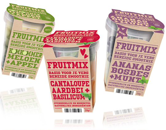 The fresher, the better and that certainly goes for the new fruit mix for smoothies of Aldi Netherlands. The sleeves that we developed surprise with their modern, firm typography that is set in a single signal color for each smoothie variety and put on a kraft paper surface. Because the design of this packaging design basically consists of typography, it strongly communicates the benefits of the product and stands out on shelf.
==
Hoe verser, hoe beter en dat geldt zeker ook voor de nieuwe Fruitmix voor smoothies van Aldi Nederland. De sleeves die wij daarvoor ontwikkeld hebben verrassen door hun modern, robuuste typografie die voor elke smoothie soort slechts in ��n enkele signaalkleur is gezet op een kraftpapieren ondergrond. Doordat het design van dit verpakkingsontwerp vrijwel alleen uit typografie bestaat, communiceert het sterk de benefits van het product en valt het goed op in het schap.
POSTED IN food | no comments »
January 29th, 2018 | 02:11 pm
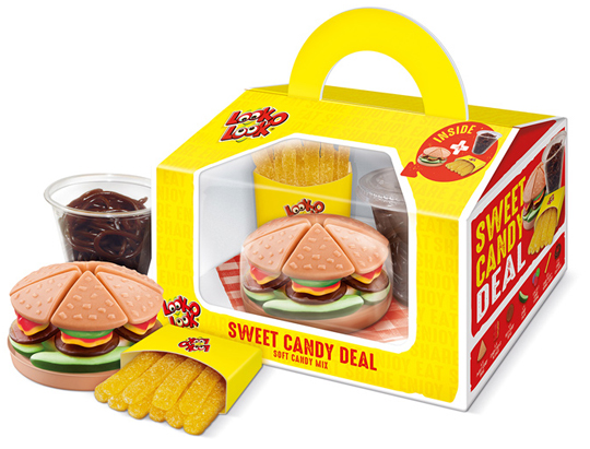 Look-O-Look’s Sweet Candy Deal is a playful gifting that contains three candy products: a candy burger, a cup of coke and a bag of French fries, all made of small candies. The packaging design developed by Stepfive has a great recognition and is convenient to be carried by the handle. In addition, it offers a good view of the products in the box through the large viewing window. The napkin at the bottom makes it a wrap!
A QR code on the packaging leads to an online Scan & Win promotion. The Sweet Candy Deal is a real eye-catcher, a surprising gift and a delicious treat.
==
De Sweet Candy Deal van Look-O-Look is een speelse gifting die bestaat uit een drietal snoepproducten: de Candy Burger, een bekertje cola en een zakje Franse frietjes, allemaal gemaakt van kleine snoepjes. Het door ons ontwikkelde packaging design heeft een grote herkenbaarheid en is handig te dragen door het handvat. Daarnaast biedt het goed zicht op de producten in de box door middel van het grote zichtvenster. Het servetje op de bodem maakt de look van de box helemaal af.
Op de verpakking staat een QR-code waarmee kan worden meegedaan aan de online Scan & Win actie. De Sweet Candy Deal is hiermee een echte packaging eye-catcher geworden, een verrassend cadeau bovendien en een heerlijke traktatie.
TAGS: candy, Dutch, Look-O-Look, Netherlands, packaging design, Stepfive, sweet candy deal
POSTED IN food | no comments »
January 16th, 2018 | 01:04 pm
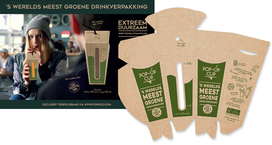 For the Horecava introduction of the Pop-Up Cup, the world’s most ‘green’ drink packaging, we have developed the packaging and a matching small introduction campaign. The Pop-Up Cup drink packaging is innovative and very suitable for filling of beverages on the spot. The Pop-Up Cup is a box with a pouch that comes flat. The box opens up, as one squeezes it from the side. Put a straw through the opening in the top and it is also 100% leak-proof.
The Pop-Up Cup is exclusively available via www.fonkels.com
==
Voor de Horecava introductie van de Pop-Up Cup, ‘s werelds meest groene drinkverpakking, hebben wij de introductie verpakking ontwikkeld, plus een bijpassende mini-campagne. De Pop-Up Cup drinkverpakking is innovatief en zeer geschikt voor het ter plekke vullen van dranken. De Pop-Up Cup is een doosje met een zakje dat plat wordt geleverd en dus weinig plaats inneemt. Het doosje opent zich doordat je het aan de zijkant samenknijpt. Even vullen, de bovenkant samenvouwen en klaar is deze drinkverpakking! Tot slot enkel nog een rietje door de opening in de bovenkant steken en het is ook nog 100% lekvrij.
De Pop-Up Cup is exclusief verkrijbaar via www.fonkels.com
POSTED IN food, non food | no comments »
November 20th, 2017 | 11:07 am
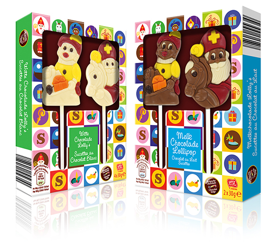 Each year at the end of november, St. Nicholas is coming to The Netherlands, Belgium en parts of Germany. All the way from Spain as the story goes. We celebrate his birthday on the 5th of december. A great time of the year for children, because he’s bringing presents, candy and chocolate together with personalised poems.
For Aldi Belgium we created cheerful and colourful St. Nicholas packaging design, built around icons which represent typical St. Nicholas features such as presents, Nicholas’ horse Amerigo, black Pete’s baret, a shoe with carrots and chocolate letters. This packaging design is developed for white and milk chocolate St. Nicholas lollipops.
==
Elk jaar eind november komt Sinterklaas weer aan in Nederland, Belgi� en delen van Duitsland. Helemaal vanuit Spanje, zoals het verhaal gaat. Op 5 december vieren we pakjesavond. Een fantastische periode voor de kinderen, want hij brengt weer veel cadeau’s, snoep en chocola en een mooi persoonlijk gedicht.
Voor Aldi Belgi� hebben we een vrolijk en kleurrijk packaging design gecre�erd, dat is opgebouwd uit iconen die de verschillende typische Sinterklaas items weergeven, zoals cadeautjes, een zwarte Pieten baret, wortels in een schoen en chocolade letters. Het is ontwikkeld voor witte en melkchocolade Pieten en Sinterklazen.
TAGS: Aldi, children, chocolate, Martinez Chocolade, Netherlands, packaging design, Sinterklaas, St. Nicholas, St. Nicolaas, Stepfive
POSTED IN food | no comments »
October 12th, 2017 | 04:03 pm
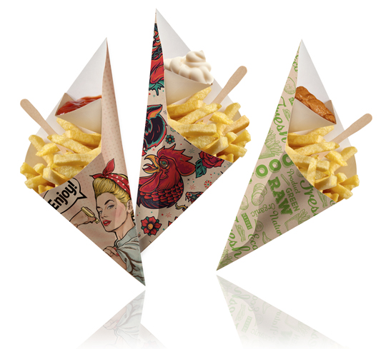 Stepfive created a series of striking designs for Fonkels Disposables Artist Line (fonkels.com). This is a special series of Chip ‘n Dip cones. They are made of fat resistant FSC certified cardboard. The material is sourced from renewable forests and is 100% recyclable after use. There is a complete line developed with different themes that all connect well to the the market needs to be distinctive in the cafeteria segment.
==
Voor de Artist Line van Fonkels Disposables (fonkels.com) heeft Stepfive een serie opvallende designs gecre�erd. De Artist Line is een speciale serie van Chip ‘n Dip frietzakken. Deze zijn gemaakt van vetwerend FSC gecertificeerd karton. Het materiaal is afkomstig uit hernieuwbare bossen en is na gebruik 100% recyclebaar. Er is een complete lijn ontwikkeld met verschillende thema’s die allemaal goed aansluiten op de behoefte uit de markt om onderscheidend te zijn in het cafetaria segment.
POSTED IN food | no comments »
September 26th, 2017 | 04:10 pm
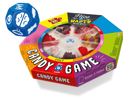 Board games are fun and that’s why Look-O-Look created a board game that brings people back together to play a game: Nice Or Nasty, The Candy Game. Roll the dice and find out who has the best poker face while daring to eat a sweet, fresh, sour or perhaps spicy candy.
In collaboration with Look-O-Look we developed an attractive packaging design for this new concept with the look of a real board game. Wondering how Nice Or Nasty is played? Click here for the video.
Nice Or Nasty. Do you take the challenge?!
==
Bordspellen zijn leuk en van alle tijden en daarom heeft Look-O-Look met Nice Or Nasty, The Candy Game een bordspel gerealiseerd dat je weer �cht samen om de tafel brengt. Speel het spel met vrienden en familie. De speciaal voor dit spel ontwikkelde dobbelsteen laat je ontdekken wie er met de beste pokerface een zoet, fris, zuur of misschien juist wel pittig snoepje durft te eten.
Met het door ons in samenwerking met Look-O-Look ontwikkelde aantrekkelijke packaging design heeft dit nieuwe concept de uitstraling van een echt bordspel meegekregen. Ook benieuwd hoe Nice Or Nasty gespeeld wordt? Klik hier voor de video.
Nice Or Nasty, durf jij het aan?!
TAGS: candy, Dutch, Look-O-Look, Netherlands, nice or nasty, packaging design, Stepfive
POSTED IN food | no comments »
September 08th, 2017 | 11:26 am
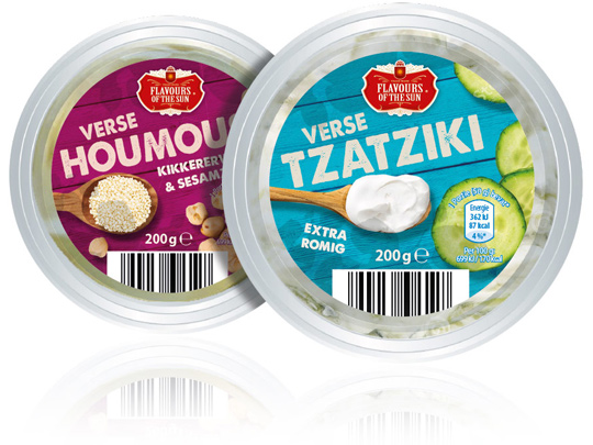 Stepfive was asked by Aldi Netherlands to redesign their private label Flavours of the Sun. A few years ago Stepfive already developed the name, branding and packaging design and now it was about time for something new. The packaging design is enriched with intense and bright colors that refer to the countries of the South. The wooden texture in the background and the tasteful photography of ingredients makes this restyle complete.
==
Aldi Nederland heeft Stepfive gevraagd een redesign aan het private label Flavours of the Sun te geven. Nadat Stepfive voor dit merk enkele jaren geleden al de naamstelling, branding en het packaging design had ontwikkeld, was het merk toe aan een opfrisbeurt. Het verpakkingsdesign is verrijkt met intense en heldere kleuren die refereren aan de zuidelijke landen. De houtstructuur op de achtergrond en de smaakvolle fotografie van ingredi�nten maken deze restyle helemaal af.
TAGS: Aldi, Dutch, Flavours of the Sun, Netherlands, packaging design, rebranding, redesign, Stepfive
POSTED IN food | no comments »


