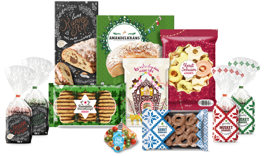
February 09th, 2018 | 03:37 pm
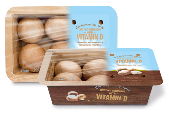 Banken Champignons serves with the vitamin D mushrooms the still growing demand for healthy and natural food. The innovative (chestnut) mushrooms are available in England, Germany and The Netherlands since last year. We were asked to develop the branding and packaging design. This resulted in a tray of kraft paper carton with an organic touch, due to the wood structure printing on it. The topseal communicates clearly the benefits of this unique product with a bright visual of air, sun and grass which emphasizes the healthyness of the product once again.
==
Banken Champignons speelt met haar vitamine D champignons in op de nog altijd groeiende vraag naar gezonde en natuurlijke voeding. De innovatieve (kastanje)champignons zijn sinds vorig jaar op de Nederlandse, Duitse en Engelse markt verkrijgbaar en wij mochten voor de branding en het design zorgen. Het heeft geresulteerd in een bakje van kraftkarton met een hoog biologische feel door de bedrukking van houtstructuur. De topseal communiceert nogmaals helder en duidelijk de benefits van het unieke product in een visual van lucht, zon en gras wat het gezonde van het product nog eens nadrukkelijk onderstreept.
TAGS: Banken Champignons, brand identity, Dutch, packaging design, Stepfive, Vitamin D
POSTED IN food | no comments »

January 29th, 2018 | 02:11 pm
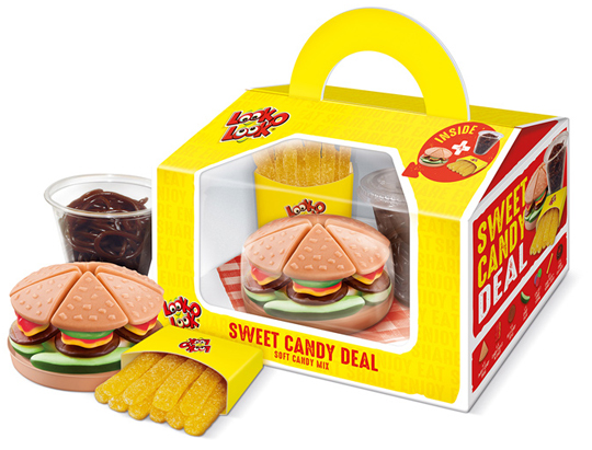 Look-O-Look’s Sweet Candy Deal is a playful gifting that contains three candy products: a candy burger, a cup of coke and a bag of French fries, all made of small candies. The packaging design developed by Stepfive has a great recognition and is convenient to be carried by the handle. In addition, it offers a good view of the products in the box through the large viewing window. The napkin at the bottom makes it a wrap!
A QR code on the packaging leads to an online Scan & Win promotion. The Sweet Candy Deal is a real eye-catcher, a surprising gift and a delicious treat.
==
De Sweet Candy Deal van Look-O-Look is een speelse gifting die bestaat uit een drietal snoepproducten: de Candy Burger, een bekertje cola en een zakje Franse frietjes, allemaal gemaakt van kleine snoepjes. Het door ons ontwikkelde packaging design heeft een grote herkenbaarheid en is handig te dragen door het handvat. Daarnaast biedt het goed zicht op de producten in de box door middel van het grote zichtvenster. Het servetje op de bodem maakt de look van de box helemaal af.
Op de verpakking staat een QR-code waarmee kan worden meegedaan aan de online Scan & Win actie. De Sweet Candy Deal is hiermee een echte packaging eye-catcher geworden, een verrassend cadeau bovendien en een heerlijke traktatie.
TAGS: candy, Dutch, Look-O-Look, Netherlands, packaging design, Stepfive, sweet candy deal
POSTED IN food | no comments »

October 31st, 2017 | 03:45 pm
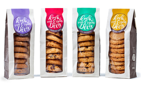 Delicious, healthy and tasteful and eco-responsible packaging design. These four come effortlessly together in the new cookies line of artisan bakery ‘Van Eigen Deeg’ from Nijmegen. Stepfive created the branding and packaging design for these products. In close cooperation with the client a packaging material solution has been found that suits both the product and the appearance. It is found in a compostable packaging, consisting of a two layered cellulose inside, which is wrapped in paper made from agricultural waste (PaperWise) of Bio4Pack.
The labels and the glue used for this packaging comply with the strict EN13432 rules and therefor can be thrown away in the green waste bin after use. A professional composter will decompost the materials within 90 days.
Sustainability and design: hand in hand with Van Eigen Deeg and Stepfive!
==
Lekker, gezond �n smaakvol en verantwoord verpakt. Deze vier gaan moeiteloos samen in de nieuwe koekjeslijn van de ambachtelijke koekjesbakker ‘Van Eigen Deeg’ uit Nijmegen. Stepfive heeft de branding en het packaging design gecre�erd voor deze mooie producten. In nauwe samenwerking met de klant is er gekeken naar een verpakkingsmaterialen oplossing passend bij het product en de uitstraling. Deze is gevonden in een composteerbare verpakking bestaande uit een 2-laags cellulose binnenwerk dat aan de buitenzijde voorzien is van een papieren wikkel vervaardigd uit landbouwafval (PaperWise) van Bio4Pack.
Omdat ook de etiketten en de lijm die gebruikt wordt voldoen aan de strenge EN13432 norm voor compostering mogen deze verpakkingen na gebruik gewoon in de groene afvalbak en vergaan ze in een professionele composteringsinstallatie binnen 90 dagen.
Duurzaamheid en design: hand in hand bij Van Eigen Deeg en Stepfive!
TAGS: artisanal, Bio4Pack, compostable, cookies, Dutch, eco-responsible, EN13432, Netherlands, packaging design, sustainability, Van Eigen Deeg
POSTED IN food | no comments »

October 26th, 2017 | 10:46 am
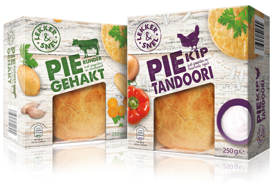 A couple of years ago, we developed the private label Smakelijk Gemak for Aldi NL and now it was about time for something new. Chosen is for an entirely new name, branding and packaging design. All this is developed by Stepfive, with which the new private label ‘Lekker & Snel’ was created, which is now going to be introduced in phases.
The packaging design always consists of a base of wood structure, which is used in different shapes and colors for the various products. The tasteful photography of both the product and the ingredients is shot with the perspective from above. Combined with the solid looking typography and use of woodcut illustrations, there is an effective, new packaging design that is completely contemporary.
==
Enkele jaren geleden hebben wij voor Aldi NL het private label Smakelijk Gemak ontwikkeld, dat na al die tijd wel weer eens toe was aan een opfrisbeurt. Gekozen is voor een geheel nieuwe naamstelling, branding en bijbehorend packaging design. Dit alles is door ons in huis ontwikkeld, waarmee het nieuwe private label ‘Lekker & Snel’ is ontstaan, dat nu gefaseerd ingevoerd gaat worden. Het verpakkingsdesign bestaat altijd uit een basis van houtstructuur, die in verschillende vormen en kleuren voor de diverse producten wordt gebruikt. De smakelijke fotografie van zowel het product als de ingredi�nten valt op door het perspectief van bovenaf. In combinatie met de stevig en ambachtelijk ogende typografie en het gebruik van houtsnede illustraties staat er een doeltreffend, nieuw packaging design dat weer helemaal van nu is.
TAGS: Aldi, brand identity, Dutch, food, Lekker & Snel, Netherlands, packaging design, smakelijk gemak, Stepfive, typography
POSTED IN food | no comments »

September 26th, 2017 | 04:10 pm
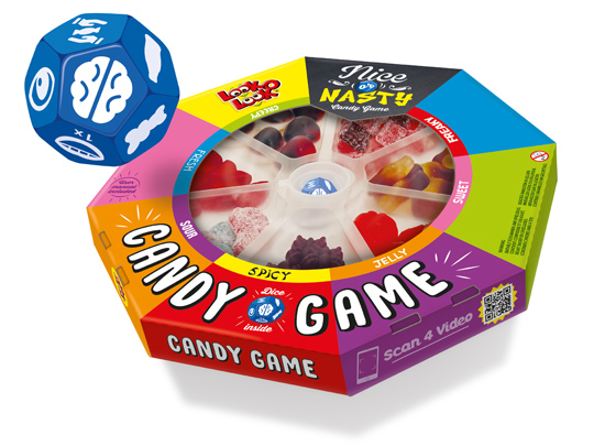 Board games are fun and that’s why Look-O-Look created a board game that brings people back together to play a game: Nice Or Nasty, The Candy Game. Roll the dice and find out who has the best poker face while daring to eat a sweet, fresh, sour or perhaps spicy candy.
In collaboration with Look-O-Look we developed an attractive packaging design for this new concept with the look of a real board game. Wondering how Nice Or Nasty is played? Click here for the video.
Nice Or Nasty. Do you take the challenge?!
==
Bordspellen zijn leuk en van alle tijden en daarom heeft Look-O-Look met Nice Or Nasty, The Candy Game een bordspel gerealiseerd dat je weer �cht samen om de tafel brengt. Speel het spel met vrienden en familie. De speciaal voor dit spel ontwikkelde dobbelsteen laat je ontdekken wie er met de beste pokerface een zoet, fris, zuur of misschien juist wel pittig snoepje durft te eten.
Met het door ons in samenwerking met Look-O-Look ontwikkelde aantrekkelijke packaging design heeft dit nieuwe concept de uitstraling van een echt bordspel meegekregen. Ook benieuwd hoe Nice Or Nasty gespeeld wordt? Klik hier voor de video.
Nice Or Nasty, durf jij het aan?!
TAGS: candy, Dutch, Look-O-Look, Netherlands, nice or nasty, packaging design, Stepfive
POSTED IN food | no comments »

September 08th, 2017 | 11:26 am
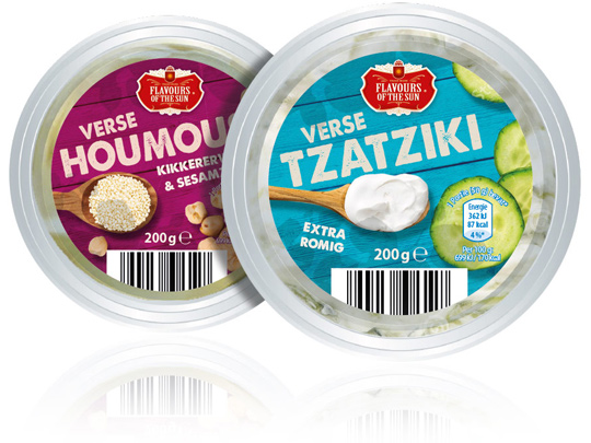 Stepfive was asked by Aldi Netherlands to redesign their private label Flavours of the Sun. A few years ago Stepfive already developed the name, branding and packaging design and now it was about time for something new. The packaging design is enriched with intense and bright colors that refer to the countries of the South. The wooden texture in the background and the tasteful photography of ingredients makes this restyle complete.
==
Aldi Nederland heeft Stepfive gevraagd een redesign aan het private label Flavours of the Sun te geven. Nadat Stepfive voor dit merk enkele jaren geleden al de naamstelling, branding en het packaging design had ontwikkeld, was het merk toe aan een opfrisbeurt. Het verpakkingsdesign is verrijkt met intense en heldere kleuren die refereren aan de zuidelijke landen. De houtstructuur op de achtergrond en de smaakvolle fotografie van ingredi�nten maken deze restyle helemaal af.
TAGS: Aldi, Dutch, Flavours of the Sun, Netherlands, packaging design, rebranding, redesign, Stepfive
POSTED IN food | no comments »

April 14th, 2017 | 01:32 pm
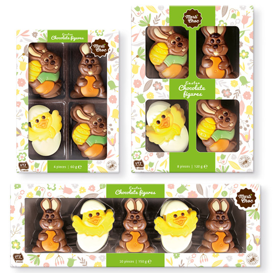 Another new project for Martinez Chocolade found its way to the stores. A modern line for the Easter was created especially for their brand MartiChoc. Little naive illustrations in soft colors constructed a wallpaper that was applied on all kind of boxes and all kind of formats. The delicious chocolate figures inside makes the Easter feeling complete.
==
En weer heeft een nieuw project voor Martinez Chocolade haar weg naar de winkels gevonden. Een nieuwe, moderne lijn is ontwikkeld speciaal voor het merk MartiChoc. Kleine, na�eve illustraties in zachte kleuren vormen de basis voor het achtergrondpatroon dat is uitgerold over verschillende formaten en doosjes. De heerlijke chocolade figuurtje in de doos zorgen voor het totale Paasgevoel.
TAGS: chocolate, Dutch, food, MartiChoc, Martinez Chocolade, Netherlands, packaging design, Stepfive
POSTED IN food | no comments »
April 14th, 2017 | 01:18 pm
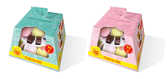 The English love their tea and their typical high tea. To celebrate that, Chupa Chups decided to make their own candy version of it: the Candy Tea Party! And again Stepfive was asked to create the packaging design. This resulted in colourful packaging design with a large window on the front and a cleverly constructed handle on top. Ideal for gifting and because of the ability to put the handle down, there’s no obstruction when stacking the boxes on the shelf.
==
De Engelsen zijn dol op hun thee �n op hun fameuze high teas. Om dat te vieren heeft Chupa Chups haar eigen snoep versie gecre�erd: de Candy Tea Party! En Stepfive is weer gevraagd het packaging design te verzorgen. Dit heeft geresulteerd in een kleurrijke verpakking met een groot zichtvenster aan de voorzijde en een handig handvat bovenop. Ideaal om te dragen en voor gifting. Het handvat kan bovendien neer geklapt worden, waardoor het stapeling in het schap niet in de weg staat.
TAGS: candy, Chupa Chups, Dutch, Look-O-Look, Netherlands, packaging design, Stepfive
POSTED IN food | no comments »

February 10th, 2017 | 12:19 pm
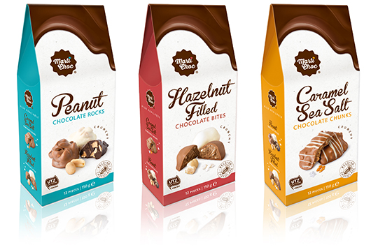 MartiChoc is a new brand of the internationally operating Dutch company Martinez Chocolade. Stepfive got the opportunity to develop the branding of this new chocolate brand. The packaging design of this ‘on the go’ line consists of three delicious flavors and was also conceptualized and created by Stepfive.
==
Voor het nieuwe merk MartiChoc van het internationaal opererende Nederlandse bedrijf Martinez Chocolade heeft Stepfive de complete branding mogen ontwikkelen. Ook het verpakkingsontwerp van deze uit drie smaken bestaande nieuwe ‘on the go’ chocolade lijn is ontwikkeld en uitgevoerd door Stepfive.
TAGS: chocolate, Dutch, MartiChoc, Martinez Chocolade, Netherlands, packaging design, Stepfive
POSTED IN food | no comments »
December 23rd, 2016 | 11:15 am
 Just hear those sleigh bells jingle-ing, Ring ting tingle-ing too.
Come on, it’s lovely weather, For a sleigh ride together with you!
It’s Christmas time again and just as last year Aldi Netherlands asked Stepfive to create a series of concepts for their 2016 Christmas packaging design. This resulted in a wide range of different designs, all with that special time of the year feel.
==
Just hear those sleigh bells jingle-ing, Ring ting tingle-ing too.
Come on, it’s lovely weather, For a sleigh ride together with you!
Het is alweer Kerstmis en net zoals vorig jaar heeft Aldi Nederland Stepfive gevraagd concepten te cre�ren voor hun Kerst packaging design. Dat heeft geresulteerd in een uitgebreide lijn van verschillende designs, allemaal met het speciale gevoel dat bij deze tijd van het jaar hoort.
TAGS: Aldi, christmas, Dutch, food, Netherlands, packaging design, Stepfive
POSTED IN food | no comments »
 Banken Champignons serves with the vitamin D mushrooms the still growing demand for healthy and natural food. The innovative (chestnut) mushrooms are available in England, Germany and The Netherlands since last year. We were asked to develop the branding and packaging design. This resulted in a tray of kraft paper carton with an organic touch, due to the wood structure printing on it. The topseal communicates clearly the benefits of this unique product with a bright visual of air, sun and grass which emphasizes the healthyness of the product once again.
 Look-O-Look’s Sweet Candy Deal is a playful gifting that contains three candy products: a candy burger, a cup of coke and a bag of French fries, all made of small candies. The packaging design developed by Stepfive has a great recognition and is convenient to be carried by the handle. In addition, it offers a good view of the products in the box through the large viewing window. The napkin at the bottom makes it a wrap!

 Board games are fun and that’s why Look-O-Look created a board game that brings people back together to play a game: Nice Or Nasty, The Candy Game. Roll the dice and find out who has the best poker face while daring to eat a sweet, fresh, sour or perhaps spicy candy.
 Stepfive was asked by Aldi Netherlands to redesign their private label Flavours of the Sun. A few years ago Stepfive already developed the name, branding and packaging design and now it was about time for something new. The packaging design is enriched with intense and bright colors that refer to the countries of the South. The wooden texture in the background and the tasteful photography of ingredients makes this restyle complete.
 Another new project for Martinez Chocolade found its way to the stores. A modern line for the Easter was created especially for their brand MartiChoc. Little naive illustrations in soft colors constructed a wallpaper that was applied on all kind of boxes and all kind of formats. The delicious chocolate figures inside makes the Easter feeling complete.
 The English love their tea and their typical high tea. To celebrate that, Chupa Chups decided to make their own candy version of it: the Candy Tea Party! And again Stepfive was asked to create the packaging design. This resulted in colourful packaging design with a large window on the front and a cleverly constructed handle on top. Ideal for gifting and because of the ability to put the handle down, there’s no obstruction when stacking the boxes on the shelf.
 MartiChoc is a new brand of the internationally operating Dutch company Martinez Chocolade. Stepfive got the opportunity to develop the branding of this new chocolate brand. The packaging design of this ‘on the go’ line consists of three delicious flavors and was also conceptualized and created by Stepfive.