 Again a wonderfull asset for our bookshelf, “packed” with inspiration: THE ART OF PACKAGE DESIGN. A recent assembly of international designers is creating highly outstanding and savvy designs to complement the nature and function of a product. Editor Wendy Xu included the Atelier LaDurance Japanese Denim packaging in the publication that is about innovative packaging designs that functions beyond ‘simply product wrappers’. A creative treasure published by Gingko Press: www.gingkopress.com


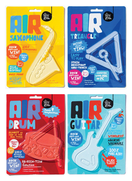 A fine example of what pakaging can do besides just containing and/or selling a product, given by Designworks Melbourne. These air-instruments are part of a ‘Play Air Campagne’, a campaign which helped raise money for an organisation called The Song Room. The Song Room is a charitable organisation who help ensure that underprivileged schools can allow their students to partake in creativity. Deservedly nominated for a Cannes Lions award for Promo & Activation.

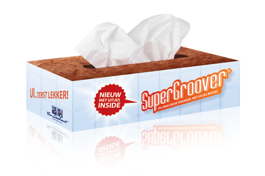 Stepfive developed packaging design (a tissue box) as part of an introduction campaign for a new take on a typical Dutch snack, the Frikandel. This new breed contains onion, so we thought it was appropriate to reach out to anyone eating it by providing free tissues for all those teary eyes. ‘So good, you could cry’.

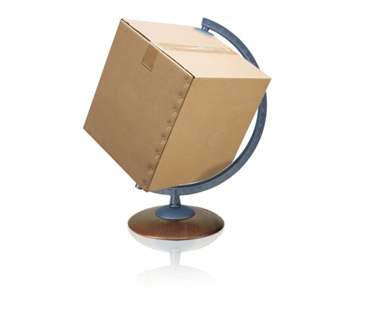 The British Standards Institution, BSI, has launched a new standard to streamline food safety systems between food manufacturers and the packaging they use for their products.
PAS 223�Prerequisite programmes and design requirements for food safety in the manufacture and provision of food packaging�provides a common international methodology for developing a prerequisite program for food and drink packaging safety. PAS 223 aims to bring consistency across global packaging industry practices. It could also potentially reduce tendering costs for packaging manufacturers who adhere to it and as help align packaging activities more closely with their clients� requirements.
Read more

As far as our crystal ball can tell us, we present you with what generally is considered as the �top five most promising trends in packaging�. We look forward to the day we can look back on this and see what more or less �happened�, and what turned out to be total BS. Here we go:
1. Sustainability – reduced packaging material; reusable and refillable packaging; and lighter-weight and biodegradable plastics. The latter reduces transportation costs and the overall carbon footprint.
2. Decorating – “Retro” and “vintage” packaging remains a top decorating trend in 2011. Also popular is packaging with simple, minimalist decorating.
3. Electronic-Enabled Packaging � we will keep on integrating the use of our mobile technology (smart-phones) in our package designs. QR codes will appear more often.
4. Packaging is Shrinking – Packaging is getting smaller because prices of certain materials are increasing. So we shrink because consumers seem to notice price increases more readily than they notice package reduction or weight loss.
5. Made in � – when your offset is mostly situated in the country where you produce, a �made in �� will likely to be seen as an added bonus. It tells that there were little transportation costs involved (sustainability), and makes you think the product suits you better than it�s cousins from the other side of the continent, world, galaxy.
For what it�s worth �

 ”Global standards on packaging and the environment have gained conclusive momentum with the acceptance of the draft international standard (DIS) texts this week, say industry experts. The new ISO-standards will address the optimization of packaging to minimise its environmental impact, the responsible use of heavy metals and other hazardous substances, the possible reuse of packages and the different modes of recycling (material, energy or composting). The new ISO world standards will most likely be available for use by industry, retail and any other interested organisation by the end of 2012.”
More on the new ISO-standards here and here (pdf).

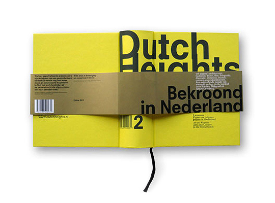 ‘Dutch Heights #2′ presents the year’s best work by award-winning Dutch architects, visual artists, actors, directors, illustrators, photographers, packaging designers, writers, poets, designers, theater makers, musicians and other performers.�’Dutch Heights #2’ is the second volume in a new series yearbooks, designed by Irma Boom and produced by the best graphic production companies in the Netherlands.

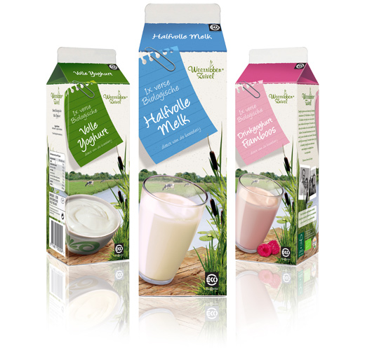 Following to this restyling, a similar fresh and natural packaging design was created by Stepfive of milk and drinks for Dutch company Weerribben Zuivel. The visuals on the packaging are showing us the origin of the milk and drinks: National Park ‘De Weerribben’ in The Netherlands with its characteristic feather reed grass. The coloured shopping list is a powerful asset to match all twelve products into a coherent range.

Students from Design Skolen Kolding, Denmark, made videos for the UNICEF Innovation – Reuse of Packaging Challenge – over a period of three weeks in January 2011. They are all works in progress. More videos at their YouTube UNICEF Innovation Channel.

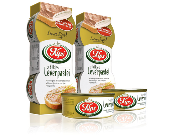 For the Dutch company Kips’, who actually celebrate their 100th anniversary this year, Stepfive created a golden packaging design for their tins with excellent liver p�t�. This exclusive and tasteful look with much attention to branding and product experience is successfully introduced at the Dutch consumer market. Kips’ is part of Zwanenberg Food Group.


