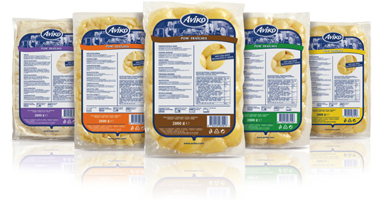
 Stepfive created a broad range of new packaging design for Aviko foodservice Pom’ Fra�ches. The new packaging consists of transparent foils with a print on top with a unique colour for each different Pom’ Fra�ches product.
Aviko, originally a Dutch company, is one of the four largest potato processing companies in the world and part of Royal Cosun, who became sole owner of Aviko in 2002.


 Ian Lifshitz (sustainability director for the Americas for Asia Pulp & Paper Group) wrote an interesting article at Food and Beverage Packaging on trends in sustainable food packaging. The article explains five contemporary trends: traceability, food waste reduction, labeling, reusable packaging and finally responsibly grown.
Read more here.

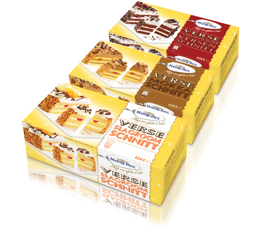 New packaging design for Ma�tre Paul�s Black Forest, Mocha and Dairy Cream bars, conceptualized and executed by Stepfive. Eyecatchers are the tasteful product visuals on each box, next to the strip with the productname and Ma�tre Paul logo on it. Each taste has its own colour signing for the strip. The recognizable yellow background (as seen with other Stepfive designs for Ma�tre Paul) is decorated with little white graphics.

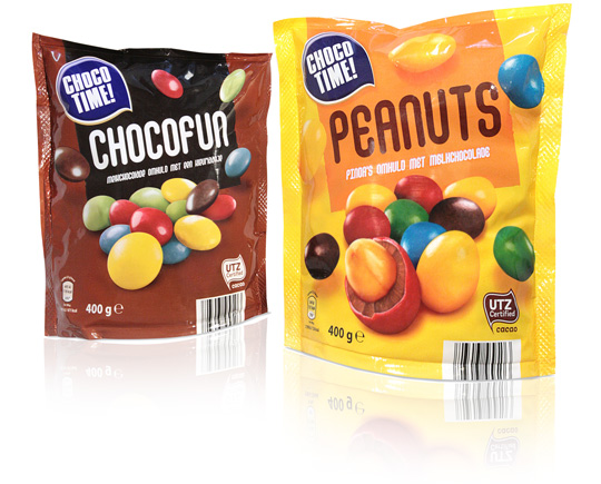 The brand Choco Time! contains a wide range of chocolate and candy products for Aldi Netherlands. The packaging design for the doypacks as shown above was created by Stepfive. There are two delicious products: Chocofun (button-shaped chocolates with a candie shell) and Peanuts (same, but with an extra peanut inside).

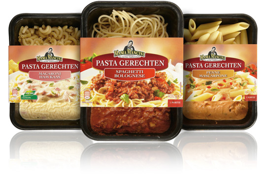 For the Italian feel products of Aldi Netherlands the brand ‘Mama Mancini’ was created. Now Stepfive extended this range of products for Aldi with ready-to-eat pasta meals.
The carton sleeves have a new design and a tasteful visual of the traditional Italian food that�s inside the packaging.

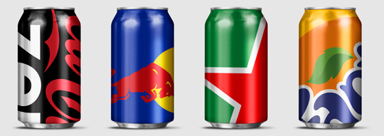 Wondering how far you can push your packaging design to the limit? Designer Ewan Yap presents his ”Big Brand Theory” on Behance with some major and iconic brands (think Heineken, Coca-Cola, Pepsi, Red Bull etc.). His beautiful work is an experiment in brand aesthetics, and also informs us on the cropability of� logos in terms of image cropability.
Check out the cropability of a brand (or the guts to leave things out).

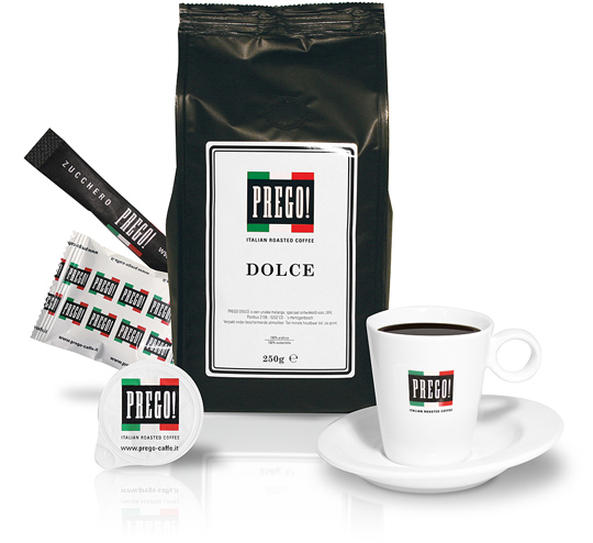 JVH (a Dutch gaming & entertainment group) asked Stepfive to create a unique branding, identity and packaging design for their own roasted coffee that will be served in all of their casino’s in The Netherlands. This resulted in a manifest typographical logo with a strong Italian atmosphere.
The new logo is applied on milk cups, sugar bags, the coffee packaging of course and on a set of dishes. Two flavours are made this far: Dolce and Forte.

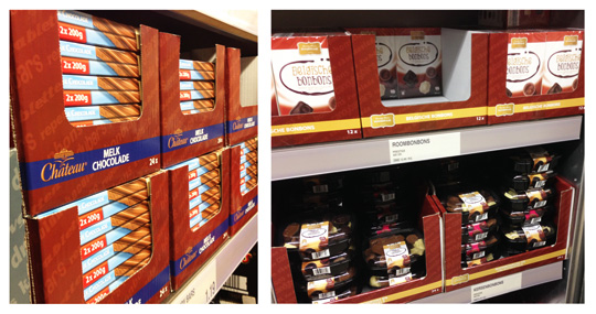 For Aldi Netherlands, Stepfive created SRP (shelf ready packaging) for several product lines, one of which is the� chocolate line. Due to the coherent use of one base colour and a different colour signing per class, this SRP ensures that customers find their way more easily to the products they’re searching for.

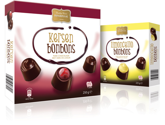 Again two new roots at the Aldi Netherlands chocolate tree: chocolate cherry bonbons with liqueur and Italian limoncello bonbons. Both go under the Bonroyaal brand and have a corresponding Bonroyaal packaging design, conceptualized and carried out by Dutch design agency Stepfive Communication & Design BNO.

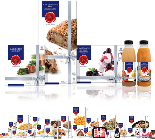 Earlier this year Aldi Netherlands asked Stepfive Communicatie & Design BNO to restyle their famous Prestige product line. This rebranding included a new logo, positioning and a complete new look for all the existing Prestige packaging design such as foils, carton boxes, tins, sleeves, pet bottles, labels etcetera. Next to it Stepfive also created a fitting shelf ready packaging (SRP) for all these Prestige products.
The result of (a very small part of) all this work is visable right here above, but within the next few weeks we’ll take a closer look at the new Prestige packaging design. So stay tuned!


