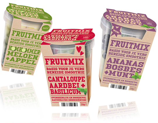
 The fresher, the better and that certainly goes for the new fruit mix for smoothies of Aldi Netherlands. The sleeves that we developed surprise with their modern, firm typography that is set in a single signal color for each smoothie variety and put on a kraft paper surface. Because the design of this packaging design basically consists of typography, it strongly communicates the benefits of the product and stands out on shelf.
==
Hoe verser, hoe beter en dat geldt zeker ook voor de nieuwe Fruitmix voor smoothies van Aldi Nederland. De sleeves die wij daarvoor ontwikkeld hebben verrassen door hun modern, robuuste typografie die voor elke smoothie soort slechts in één enkele signaalkleur is gezet op een kraftpapieren ondergrond. Doordat het design van dit verpakkingsontwerp vrijwel alleen uit typografie bestaat, communiceert het sterk de benefits van het product en valt het goed op in het schap.